
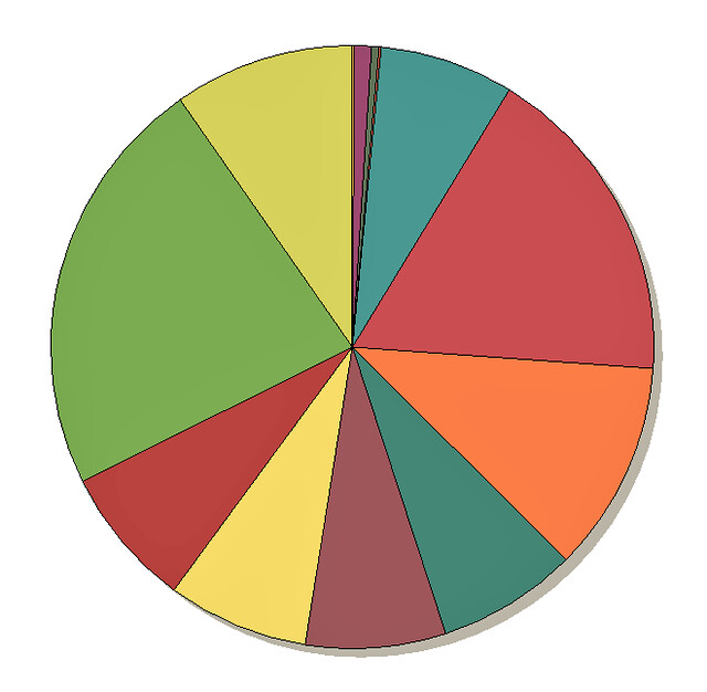
I love charts and graphs. This pie chart could be of just about anything as I deliberately cut off the legend before pasting here. It happens to be my actual, cash net worth. Each slice is a unique account or investment.
Of course, it all adds up to 100%. I just wish the whole thing were a bit larger.